
Modernizing a Brand—When It Works (and Why)
Airbnb’s Logo Redesign (2014)
They rolled out the “Bélo” symbol—a friendly, versatile mark meant to embody belonging and community. It modernized Airbnb’s visual identity while deepening emotional connection—a rare win.
Starbucks Simplifies (2011)
Dropped the “Starbucks Coffee” text from around their siren. The result? A globally recognizable icon that communicates with simplicity and confidence.
Apple’s Evolution—From Bondi Blue to Minimalism
Apple’s shift from the multi-colored rainbow logo to sleek monochrome was clean, consistent, and future-proofed—the perfect balance of evolution and brand DNA.
Why It Works: Each of these brands kept what made them iconic—the heart—and upgraded the packaging. They leaned into clarity, memorability, and emotional resonance instead of erasing their roots.
When to Rebrand—and How to Do It Right
When It’s Time:
- Your audience is shifting. New generations, new expectations.
- The brand feels stale. You need to stay relevant without losing identity.
- Core essence still matters—just needed a tune-up.
Steps to Rebrand—Without Tanking Your Image:
- Customer Insights First: Do surveys, focus groups, and listen to what your loyal base loves. If you’re messing with nostalgia, you better know why it matters.
- Market & Trend Research: Study your field. Are minimalism and modernism trends? Yes—but they must fit your personality.
- Prototype & Test: Roll out mockups and store-in-stories, not nation-wide overnight. Ask for feedback, tweak based on real responses.
- Communication Strategy: Before you rip off the band-aid, explain what’s changing and why—it’s not erasing the past; it’s evolving.
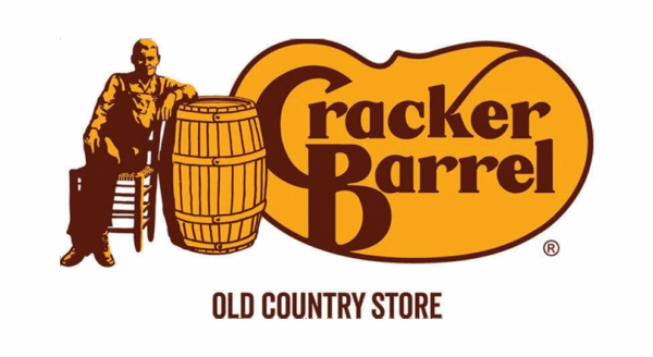
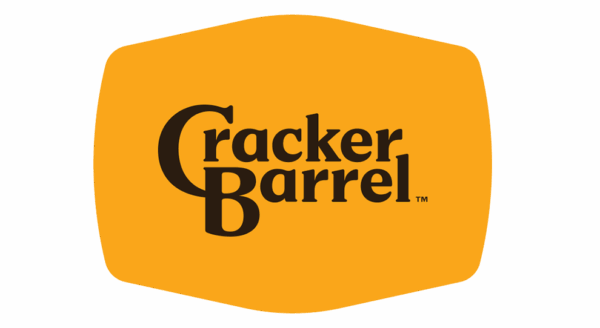
- Emotional Consistency: Keep cherished icons or symbols (like Uncle Herschel, the rocking chairs, the general-store vibes) front and center so fans don’t feel abandoned.
- Soft Launch, Listen, Learn, Iterate: Keep the option to slow down, dial back, or adjust if the audience isn’t singing along.
What Do You Think?
So, dear reader, here’s where you come in—with all your fiery passion and perceptive eyes. What’s your take on the Cracker Barrel saga? Was the modern rebrand ambitious—or tone-deaf? Did that over-bright, sleek interior strip away the warmth and nostalgia you cherish? Or maybe it’s a bold attempt at reinvention that just missed the vibe?
We’ve worked with countless brands and rebrands—companies grappling with that same dance between “fresh” and “familiar.” And if you’re looking to modernize without alienating your audience, we’ve got your back. Call us, and we’ll make sure your team and your customers are both on board and cheering—promising your public will love the result.
Final Note: The Cracker Barrel remodelling fumble is one of those unintentional lessons in branding 101—forging future appeal while honoring heritage takes strategy, empathy, and killer communication. Now it’s your turn. What do you think went wrong…and how would you fix it?

