Choosing Colors and Fonts That Fit Your Brand
If you think about some of the most popular brands, you likely know what their logo looks like. This includes graphics, colors and fonts. One of the best ways to make your brand strong and stand out from the crowd is by selecting the proper design elements that represent your company.
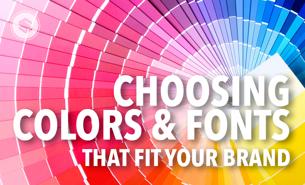
There are a lot of ways you can go about this. One way is to find or recognize what your inspiration for your business is. Multiple studies show that color has a large emotional impact on us. This is important because what inspires you will shine through when choosing your palette of colors. Your consumers will, sometimes unknowingly, feed off of this. You want to choose colors that grab their attention or speaks to their senses. For example, a fun and exciting based business would be represented well by bright colors. A calming product or service would best be represented by nature/earth tones.
By choosing images that inspire you and represent the overall feel of your business, you can choose primary and a secondary colors from here. Color increases brand recognition by 80% on average. Keep in mind certain colors just do not work well together. This takes research and practice to know. For example, red and green create a sense of movement. This makes readability hard when they are put together. Choosing contrasting colors is always a safe bet.
When it comes to fonts, your choice can change the overall feel and tone of your logo. Fonts can be the difference between traditional and modern. Mixing different fonts can create interest as long as they work well together. Consider how your logo will be used across the board. It’s important to keep everything consistent – colors and fonts – and not have to change either of these just to suit whatever you are using the logo on.
Scripts and cursive fonts are great as accents, but should be used sparingly to call attention to certain words. Serif fonts are those that have small lines extending each letter. These types of fonts are generally easier to read. They are also considered a more traditional font. San serif fonts are those without the small extending lines and are considered more modern.
Regardless of what fonts you choose or what colors you choose, make sure they represent the overall tone of your brand. As stated above, consistency is also key to creating a strong brand identity and brand recognition. Not sure where to start or if your logo follows these tips? Leave it to the professionals and call us today to get started!


